
Reimagining Webjet: A Usability Redesign
Reimagining Webjet: A Usability Redesign
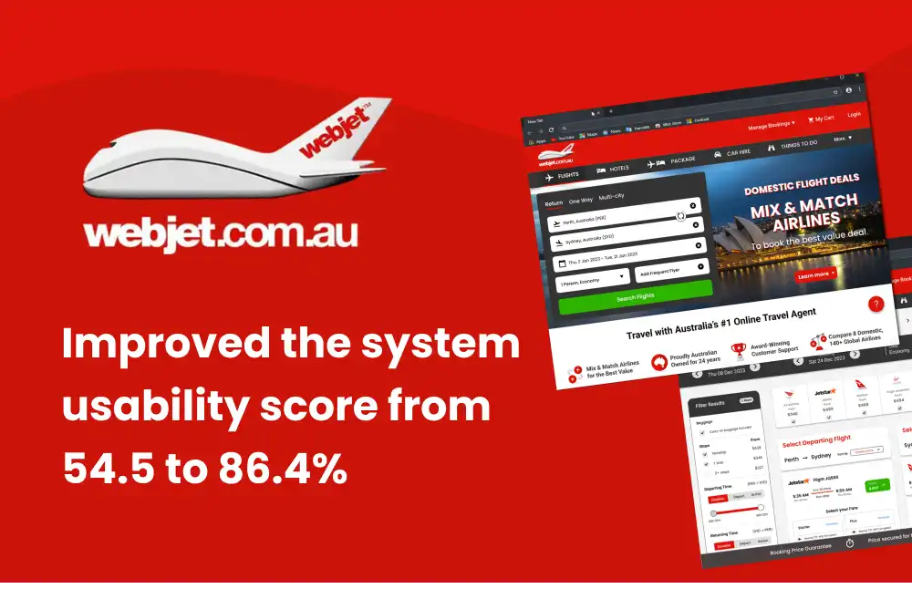
Analyzed and reworked Webjet’s desktop experience using user testing and modern UX trends. Proposed targeted redesigns guided by research to boost usability and improve user satisfaction.
Analyzed and reworked Webjet’s desktop experience using user testing and modern UX trends. Proposed targeted redesigns guided by research to boost usability and improve user satisfaction.
Analyzed and reworked Webjet’s desktop experience using user testing and modern UX trends. Proposed targeted redesigns guided by research to boost usability and improve user satisfaction.
Project Overview
Project Overview
Webjet Australia is a widely used online travel agency that allows users to book flights, hotels, and other travel-related services with about 1.150 million visitors per month. However, when compared with the competitors it has the lowest number of pages per visit and highest bounce rate among other factors, which could suggest that the users are facing usability/user experience issues on the website which are hampering the performance and growth.
Webjet Australia is a widely used online travel agency that allows users to book flights, hotels, and other travel-related services with about 1.150 million visitors per month. However, when compared with the competitors it has the lowest number of pages per visit and highest bounce rate among other factors, which could suggest that the users are facing usability/user experience issues on the website which are hampering the performance and growth.
Webjet Australia is a widely used online travel agency that allows users to book flights, hotels, and other travel-related services with about 1.150 million visitors per month. However, when compared with the competitors it has the lowest number of pages per visit and highest bounce rate among other factors, which could suggest that the users are facing usability/user experience issues on the website which are hampering the performance and growth.
Limitations
Limitations
Since this is a personal project and there is no practical way to test the design changes for the business metrics, this case study focuses on identifying the user experience issues by observing a small group of test users and evaluating the usability score of the Webjet desktop website and redesigning the specific sections based on user research and current trends to create a more intuitive experience for the users which will improve the performance metrics.
Since this is a personal project and there is no practical way to test the design changes for the business metrics, this case study focuses on identifying the user experience issues by observing a small group of test users and evaluating the usability score of the Webjet desktop website and redesigning the specific sections based on user research and current trends to create a more intuitive experience for the users which will improve the performance metrics.
Since this is a personal project and there is no practical way to test the design changes for the business metrics, this case study focuses on identifying the user experience issues by observing a small group of test users and evaluating the usability score of the Webjet desktop website and redesigning the specific sections based on user research and current trends to create a more intuitive experience for the users which will improve the performance metrics.
Goal
Goal
To improve the System usability scale (SUS) score by redesigning necessary screens.
To improve the System usability scale (SUS) score by redesigning necessary screens.
Process
Process

Discover
Discover
Initial Analysis
Initial Analysis
Initial Analysis
To understand the functionality of the website and come up with the initial hypothesis from a design point of view, I started exploring around and decided to conduct a competitive analysis and heuristic evaluation as summarized below.
To understand the functionality of the website and come up with the initial hypothesis from a design point of view, I started exploring around and decided to conduct a competitive analysis and heuristic evaluation as summarized below.
To understand the functionality of the website and come up with the initial hypothesis from a design point of view, I started exploring around and decided to conduct a competitive analysis and heuristic evaluation as summarized below.
Competitive Analysis
Competitive Analysis
Competitive Analysis


Based on the numbers above, it can be seen that Webjet is falling behind in most aspects of user engagement and has the highest bounce rate and lowest pages per visit among the competitors which proves that some re-work is required to fix the issues. Additionally, Several online users reported that it was difficult to contact customer support when they had questions or issues with their bookings, as the customer support had difficulty finding the right airline price.
Based on the numbers above, it can be seen that Webjet is falling behind in most aspects of user engagement and has the highest bounce rate and lowest pages per visit among the competitors which proves that some re-work is required to fix the issues. Additionally, Several online users reported that it was difficult to contact customer support when they had questions or issues with their bookings, as the customer support had difficulty finding the right airline price.
Based on the numbers above, it can be seen that Webjet is falling behind in most aspects of user engagement and has the highest bounce rate and lowest pages per visit among the competitors which proves that some re-work is required to fix the issues. Additionally, Several online users reported that it was difficult to contact customer support when they had questions or issues with their bookings, as the customer support had difficulty finding the right airline price.
Heuristic Analysis
Heuristic Analysis
Heuristic Analysis
Inorder form a UX and design based hypothesis about why webjet is lagging behind in traffic numbers, conducted a heuristic analysis according to the core UX design principles.
Inorder form a UX and design based hypothesis about why webjet is lagging behind in traffic numbers, conducted a heuristic analysis according to the core UX design principles.
Inorder form a UX and design based hypothesis about why webjet is lagging behind in traffic numbers, conducted a heuristic analysis according to the core UX design principles.
01 Aesthetic and minimalist design
01 Aesthetic and minimalist design
01 Aesthetic and minimalist design
An outdated and not appealing UI design makes users feel that the website is not modern and trendy which may turn away first-time users/ customers to other competitors.
An outdated and not appealing UI design makes users feel that the website is not modern and trendy which may turn away first-time users/ customers to other competitors.
An outdated and not appealing UI design makes users feel that the website is not modern and trendy which may turn away first-time users/ customers to other competitors.
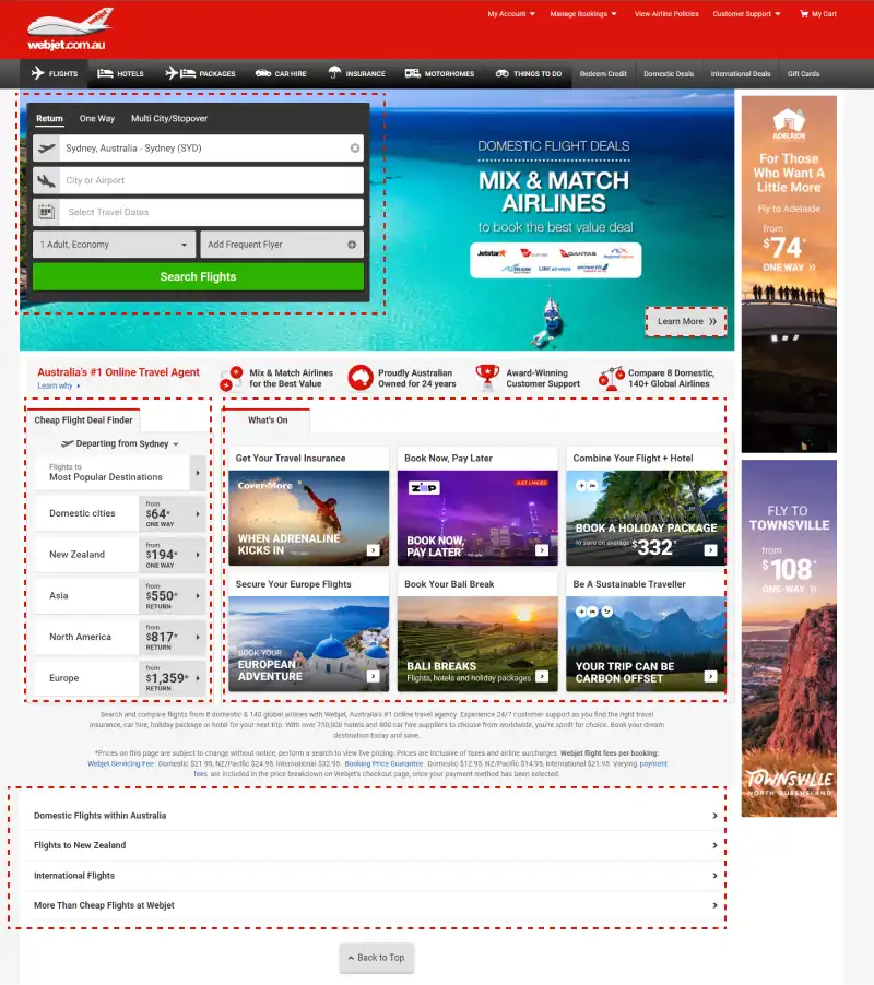
Non-linear layout and visual clutter overloads the user with information and makes it difficult to make a decision or comprehend important/ relevant information.
Non-linear layout and visual clutter overloads the user with information and makes it difficult to make a decision or comprehend important/ relevant information.
Non-linear layout and visual clutter overloads the user with information and makes it difficult to make a decision or comprehend important/ relevant information.
02 Recognition rather than recall
02 Recognition rather than recall
02 Recognition rather than recall
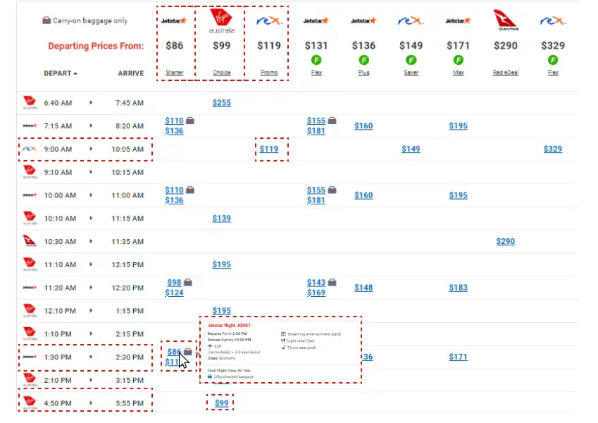
Overloading user with information to be considered while selecting a flight. The user has to look at 3 different data points such as the time of the flight, the price of the flight, and the fare rules. All of these data points are at different sections of the page which makes it difficult to make a decision or comprehend important/ relevant information.
Overloading user with information to be considered while selecting a flight. The user has to look at 3 different data points such as the time of the flight, the price of the flight, and the fare rules. All of these data points are at different sections of the page which makes it difficult to make a decision or comprehend important/ relevant information.
Overloading user with information to be considered while selecting a flight. The user has to look at 3 different data points such as the time of the flight, the price of the flight, and the fare rules. All of these data points are at different sections of the page which makes it difficult to make a decision or comprehend important/ relevant information.
03 Flexibility and efficiency of use
03 Flexibility and efficiency of use
03 Flexibility and efficiency of use
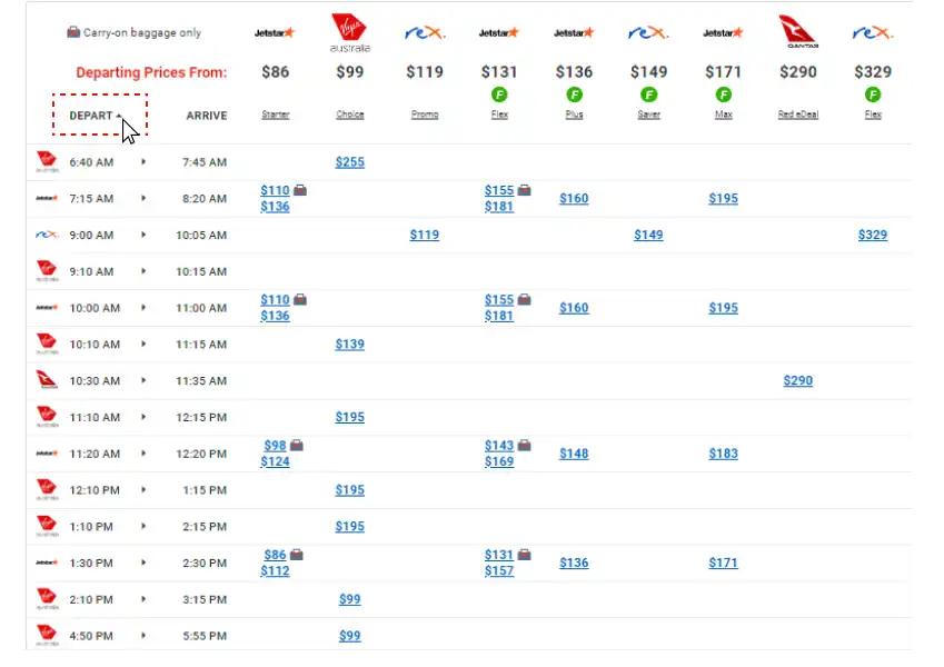
Limited and not easily discoverable use of the sorting options makes the task of finding the ideal flight more time-consuming.
Limited and not easily discoverable use of the sorting options makes the task of finding the ideal flight more time-consuming.
Limited and not easily discoverable use of the sorting options makes the task of finding the ideal flight more time-consuming.
04 User control and freedom
04 User control and freedom
04 User control and freedom
Linear and un-editable flight selection process means that if the users need a change in selection, then have to start over the selection process which results in higher drop off rate.
Linear and un-editable flight selection process means that if the users need a change in selection, then have to start over the selection process which results in higher drop off rate.
Linear and un-editable flight selection process means that if the users need a change in selection, then have to start over the selection process which results in higher drop off rate.

Solution (Preview)
Solution (Preview)
Solution (Preview)
Here is a quick preview of the redesign before we dive into the research and design decisions.
Here is a quick preview of the redesign before we dive into the research and design decisions.
Here is a quick preview of the redesign before we dive into the research and design decisions.
Primary User Research
Primary User Research
Primary User Research
To test the hypothesis and verify the information discovered in the initial analysis, I recruited participants to be a part of user research which comprised of activities such as answering an interview, completing a few predefined tasks on the website, and rating the website using a system usability scale.
To test the hypothesis and verify the information discovered in the initial analysis, I recruited participants to be a part of user research which comprised of activities such as answering an interview, completing a few predefined tasks on the website, and rating the website using a system usability scale.
To test the hypothesis and verify the information discovered in the initial analysis, I recruited participants to be a part of user research which comprised of activities such as answering an interview, completing a few predefined tasks on the website, and rating the website using a system usability scale.
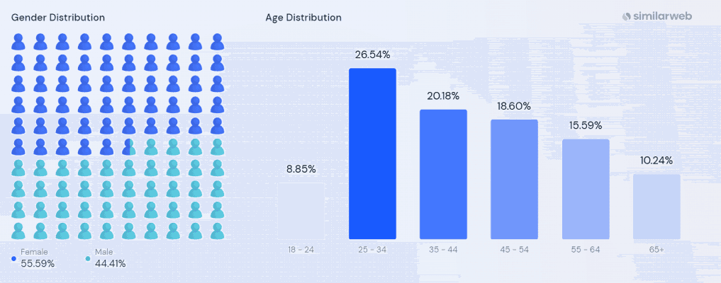
According to open source data found online it can be seen that the people of age group of 25- 34 and females are the most frequent users for Webjet.
According to open source data found online it can be seen that the people of age group of 25- 34 and females are the most frequent users for Webjet.
According to open source data found online it can be seen that the people of age group of 25- 34 and females are the most frequent users for Webjet.
Hence, I’ve recruited 5 participants, between the ages of 22–29, 3 females and 2 males, working professionals based in Australia and are first-time users of Webjet to book their flight tickets to see how a new user feels using the website.
Hence, I’ve recruited 5 participants, between the ages of 22–29, 3 females and 2 males, working professionals based in Australia and are first-time users of Webjet to book their flight tickets to see how a new user feels using the website.
Hence, I’ve recruited 5 participants, between the ages of 22–29, 3 females and 2 males, working professionals based in Australia and are first-time users of Webjet to book their flight tickets to see how a new user feels using the website.
The participants were given small tasks to complete in a moderated usability test such as:
1. Finding the cheapest flight to their destination,
2. Find the flight to depart or arrive at a particular time of the day,
3. Compare various packages (fare rules) offered by the airline for a specific flight,
Followed by filling the system usability scale and a short interview to understand how the users felt while using the website.
The participants were given small tasks to complete in a moderated usability test such as:
1. Finding the cheapest flight to their destination,
2. Find the flight to depart or arrive at a particular time of the day,
3. Compare various packages (fare rules) offered by the airline for a specific flight,
Followed by filling the system usability scale and a short interview to understand how the users felt while using the website.
The participants were given small tasks to complete in a moderated usability test such as:
1. Finding the cheapest flight to their destination,
2. Find the flight to depart or arrive at a particular time of the day,
3. Compare various packages (fare rules) offered by the airline for a specific flight,
Followed by filling the system usability scale and a short interview to understand how the users felt while using the website.
Key Insights of User Research
Key Insights of User Research
Key Insights of User Research








Define
Define
Define
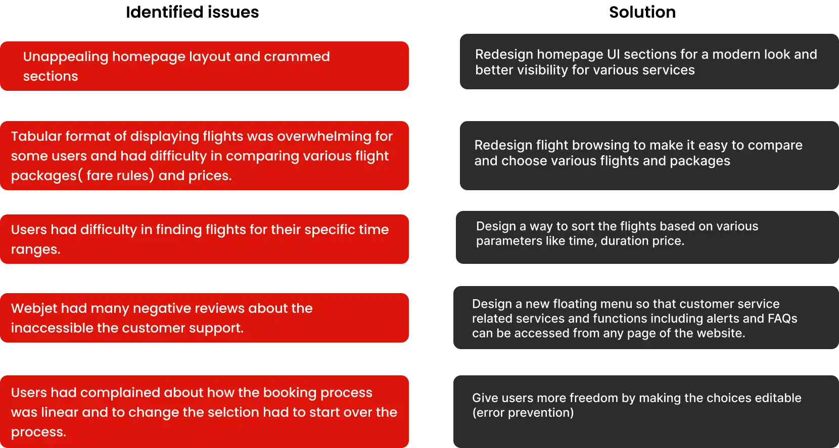
Based on the insights discovered, I’ve come up with the following design decisions that could improve the fight searching and overall user experience of the website.
Based on the insights discovered, I’ve come up with the following design decisions that could improve the fight searching and overall user experience of the website.
Based on the insights discovered, I’ve come up with the following design decisions that could improve the fight searching and overall user experience of the website.

Design
Design
Ideation and iterations
Ideation and iterations
To improve the usability score and implement design opportunities, started brainstorming different ways to display the key data points that need to be grouped for easy decision making as in the current design users seem confused by going back and forth between options.
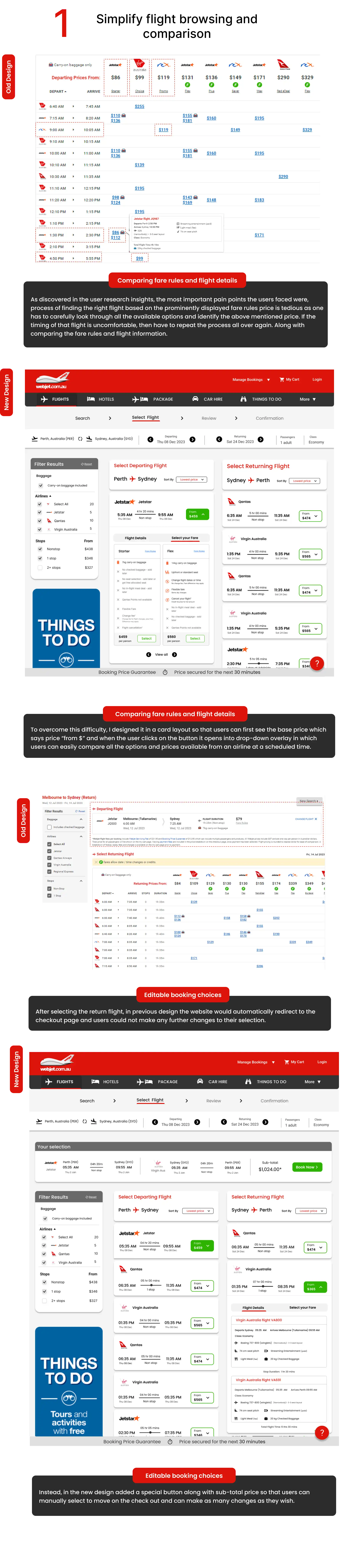
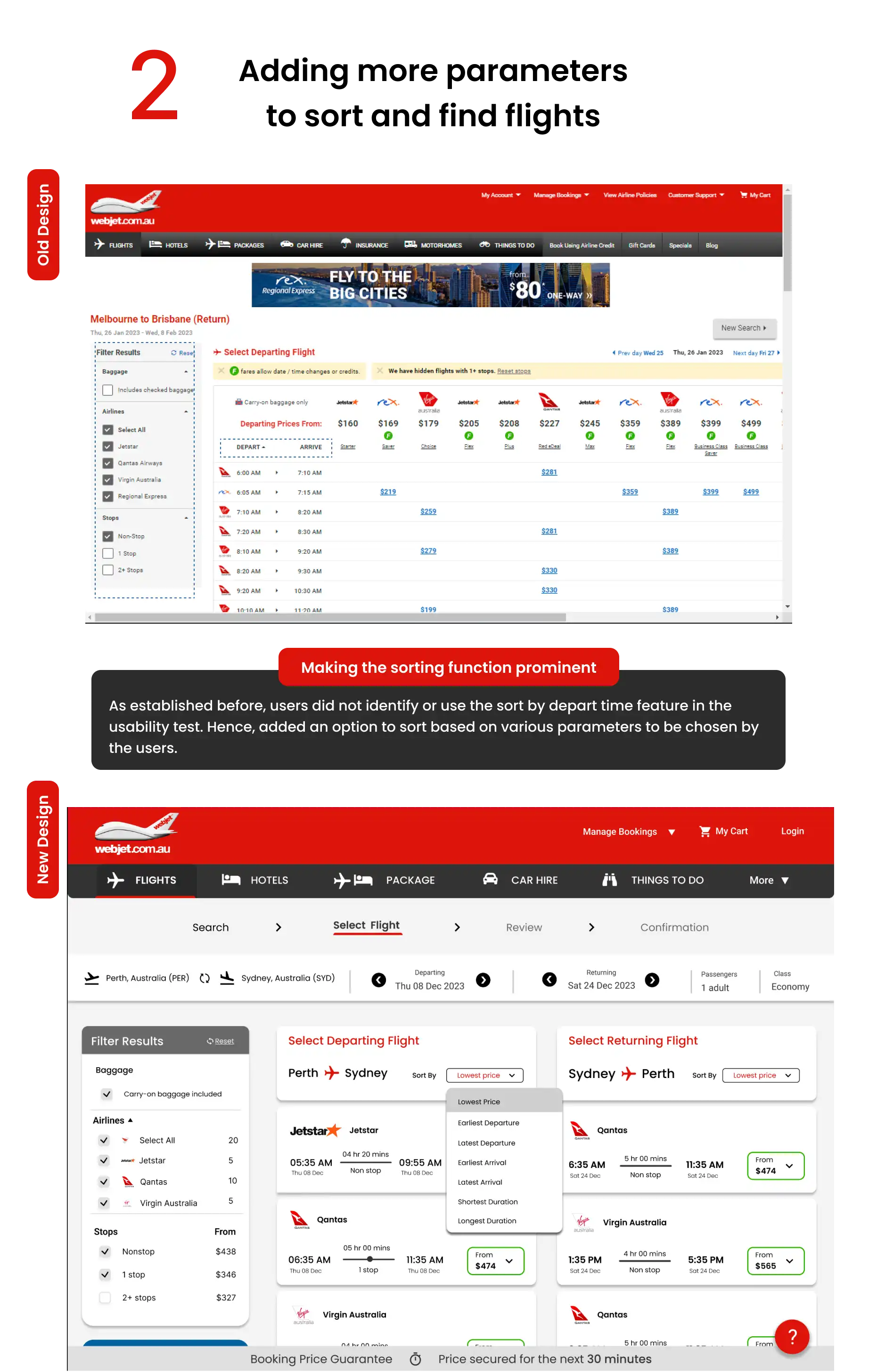
As discovered in the user research insights, the most important pain points the users faced were, that the process of finding the right flight based on the prominently displayed fare rules price is tedious as one has to carefully look through all the available options and identify the price mentioned above. If the timing of that flight is uncomfortable, then have to repeat the process all over again. Along with comparing the fare rules and flight information.
In order to solve the issue, I started by organizing and grouping the data points that the users would want to see while browsing through and selecting the flights that are as listed.
To improve the usability score and implement design opportunities, started brainstorming different ways to display the key data points that need to be grouped for easy decision making as in the current design users seem confused by going back and forth between options.
As discovered in the user research insights, the most important pain points the users faced were, that the process of finding the right flight based on the prominently displayed fare rules price is tedious as one has to carefully look through all the available options and identify the price mentioned above. If the timing of that flight is uncomfortable, then have to repeat the process all over again. Along with comparing the fare rules and flight information.
In order to solve the issue, I started by organizing and grouping the data points that the users would want to see while browsing through and selecting the flights that are as listed.
To improve the usability score and implement design opportunities, started brainstorming different ways to display the key data points that need to be grouped for easy decision making as in the current design users seem confused by going back and forth between options.
As discovered in the user research insights, the most important pain points the users faced were, that the process of finding the right flight based on the prominently displayed fare rules price is tedious as one has to carefully look through all the available options and identify the price mentioned above. If the timing of that flight is uncomfortable, then have to repeat the process all over again. Along with comparing the fare rules and flight information.
In order to solve the issue, I started by organizing and grouping the data points that the users would want to see while browsing through and selecting the flights that are as listed.

With the data points sorted, I Compared webjet’s design with various similar competitors which have better performing metrics and started ideating wireframes keeping webjet’s business logic of “mix and match airlines for best value” in mind.
With the data points sorted, I Compared webjet’s design with various similar competitors which have better performing metrics and started ideating wireframes keeping webjet’s business logic of “mix and match airlines for best value” in mind.
With the data points sorted, I Compared webjet’s design with various similar competitors which have better performing metrics and started ideating wireframes keeping webjet’s business logic of “mix and match airlines for best value” in mind.

In this wireframe/ user flow, the user has to pick the departing flight only then can they see the return flight options. Hence decided to include the return flight options in a 2 column display so that users can easily “mix and match” to see which options works the best.
In this wireframe/ user flow, the user has to pick the departing flight only then can they see the return flight options. Hence decided to include the return flight options in a 2 column display so that users can easily “mix and match” to see which options works the best.
In this wireframe/ user flow, the user has to pick the departing flight only then can they see the return flight options. Hence decided to include the return flight options in a 2 column display so that users can easily “mix and match” to see which options works the best.

Similarly came up with designs for other discovered pain points and eventually transitioned into the high-fidelity prototype.
Similarly came up with designs for other discovered pain points and eventually transitioned into the high-fidelity prototype.
Similarly came up with designs for other discovered pain points and eventually transitioned into the high-fidelity prototype.
High Fidelity/ Final design
High Fidelity/ Final design
High Fidelity/ Final design
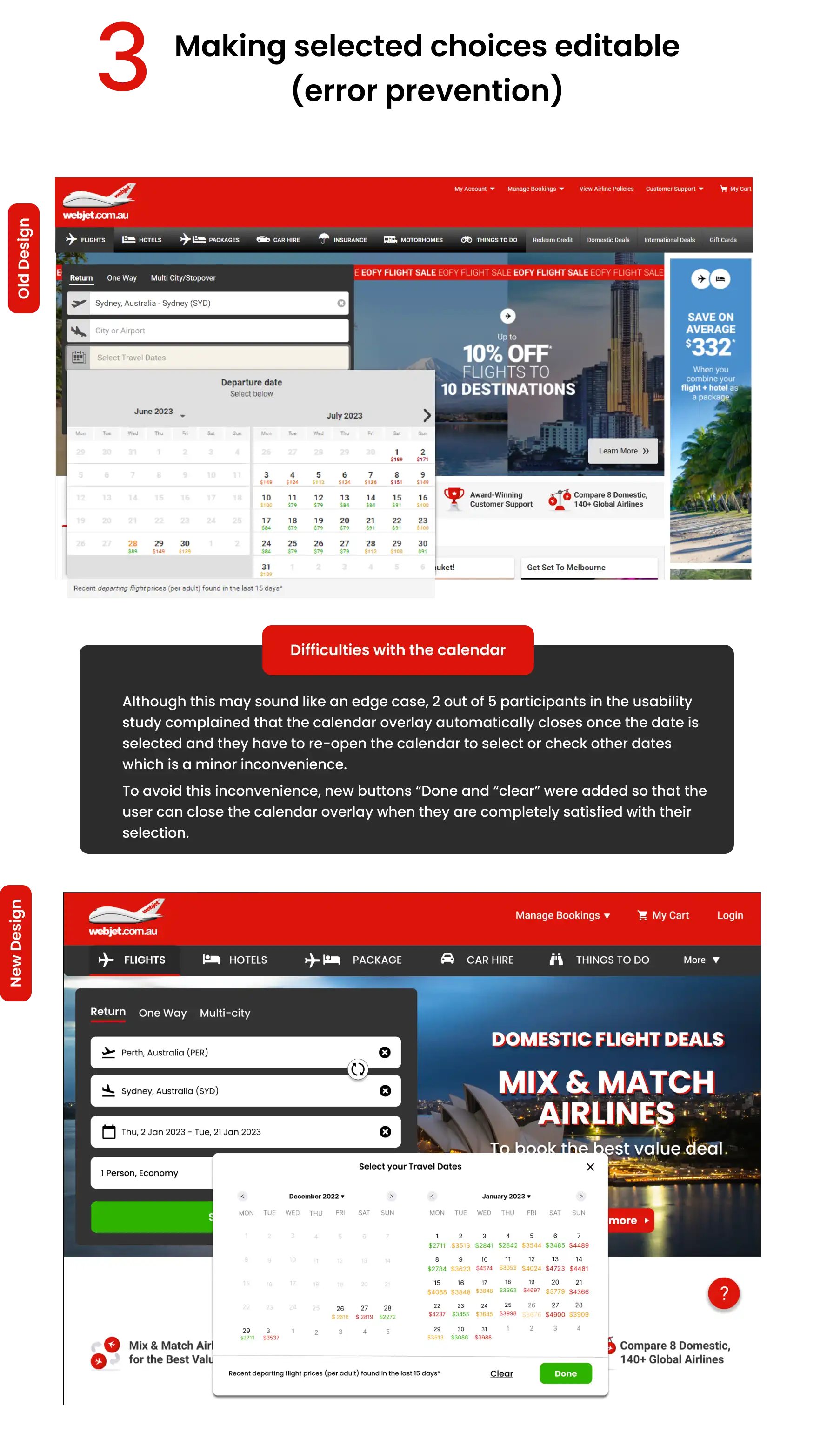

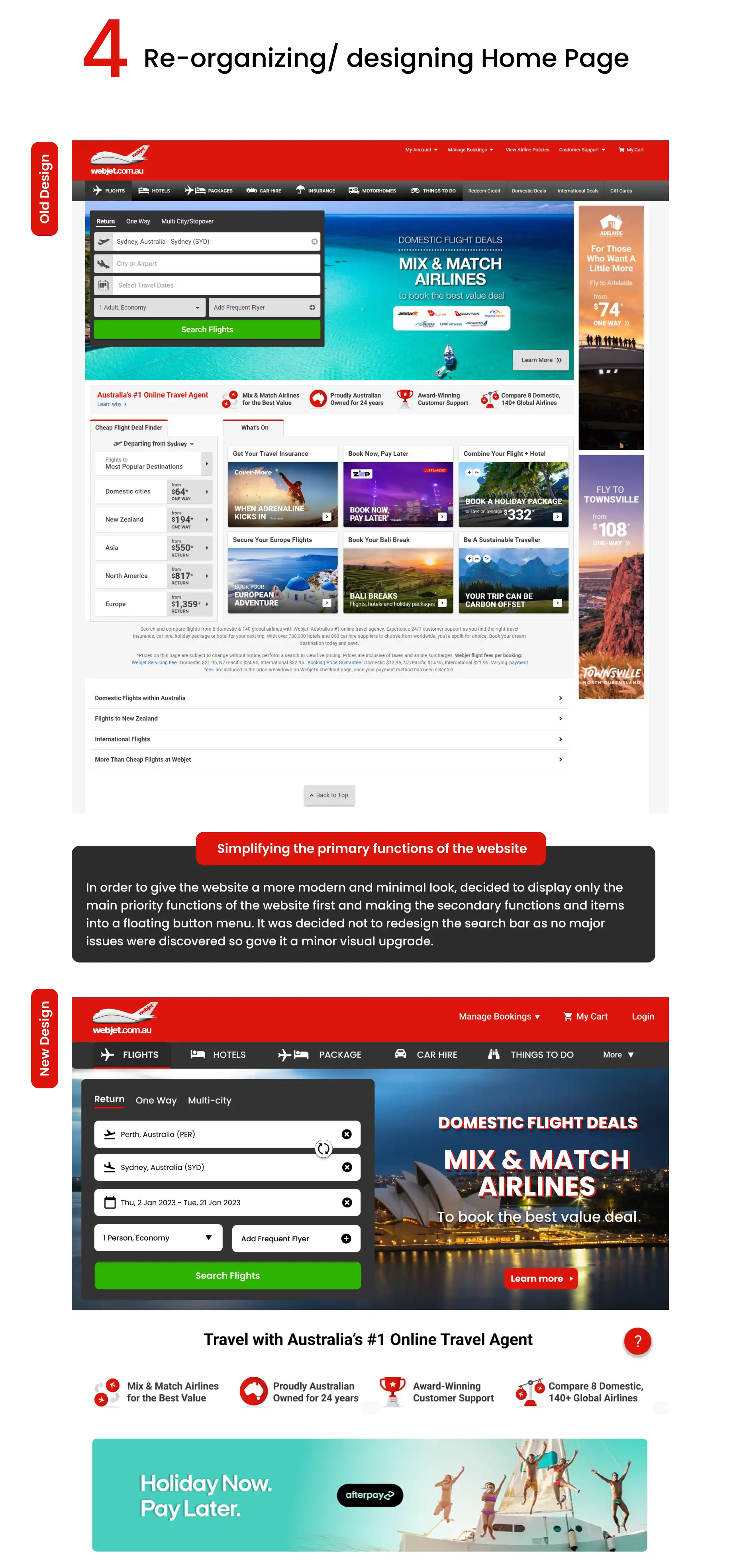

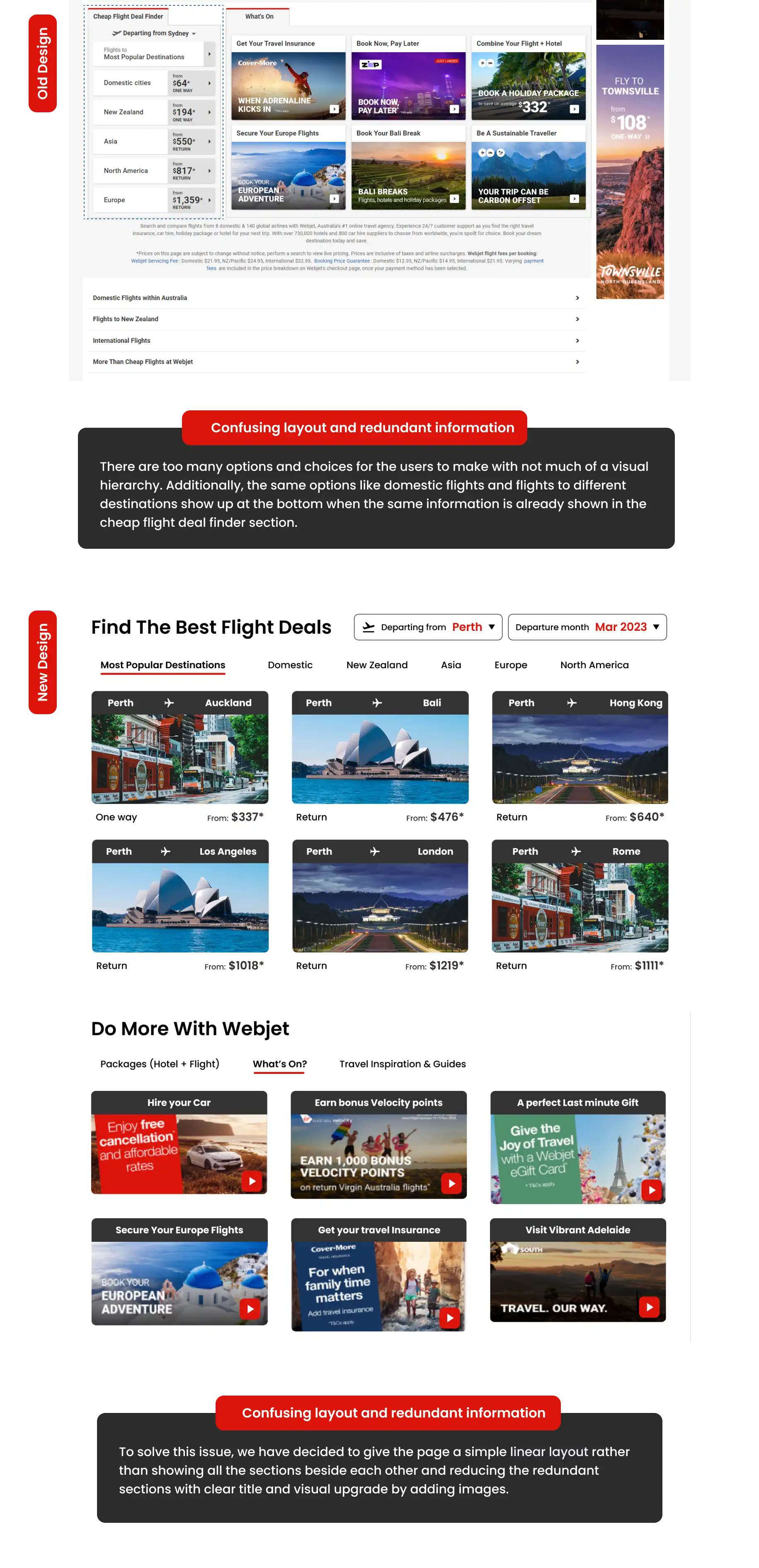
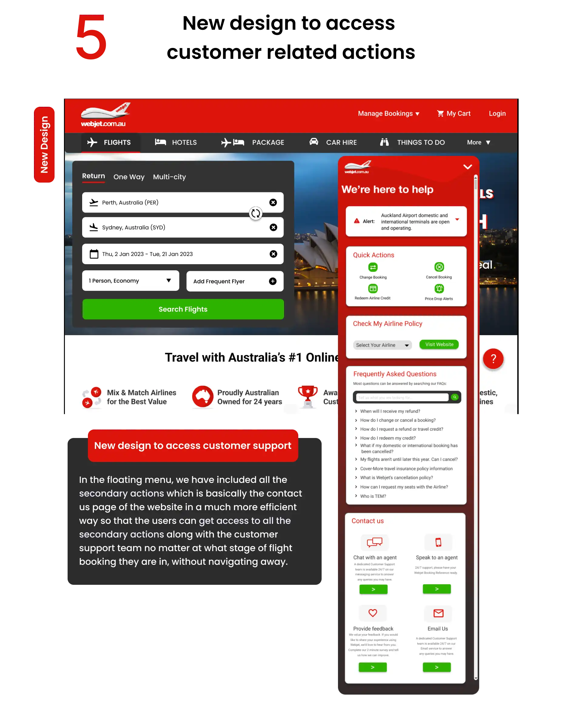
Testing the new Design
Testing the new Design
Testing the new Design
Once the new design is completed, we did another round of un moderated usability testing t and the participants were asked to complete the same tasks that were given in previous test and rate the design using the system usability scale (SUS)
Once the new design is completed, we did another round of un moderated usability testing t and the participants were asked to complete the same tasks that were given in previous test and rate the design using the system usability scale (SUS)
Once the new design is completed, we did another round of un moderated usability testing t and the participants were asked to complete the same tasks that were given in previous test and rate the design using the system usability scale (SUS)

The overall feedback was positive this time around with the average SUS score increasing to 86.4 which is almost a 32% improvement in user satisfaction and usability from the previous design.
The overall feedback was positive this time around with the average SUS score increasing to 86.4 which is almost a 32% improvement in user satisfaction and usability from the previous design.
The overall feedback was positive this time around with the average SUS score increasing to 86.4 which is almost a 32% improvement in user satisfaction and usability from the previous design.
Other takeaways
Other takeaways
Improved discoverability and accessibility: The redesigned menu made it easier for users to find what they were looking for such as airline policies, credit redemption, etc without navigating to a new page and reduced the time they spent searching for travel options.
Easy to understand flight information and options: The redesigned website simplified the presentation of flight choices and reduced the load on the users to help them make decisions quickly by providing information in an easy-to-understand way and also by providing various filters.
Modern look and visual upgrade: The new design, especially on the homepage, avoided the visual clutter and the participants found the linear design easy to understand and better project the brand of Webjet.
Improved discoverability and accessibility: The redesigned menu made it easier for users to find what they were looking for such as airline policies, credit redemption, etc without navigating to a new page and reduced the time they spent searching for travel options.
Easy to understand flight information and options: The redesigned website simplified the presentation of flight choices and reduced the load on the users to help them make decisions quickly by providing information in an easy-to-understand way and also by providing various filters.
Modern look and visual upgrade: The new design, especially on the homepage, avoided the visual clutter and the participants found the linear design easy to understand and better project the brand of Webjet.
Improved discoverability and accessibility: The redesigned menu made it easier for users to find what they were looking for such as airline policies, credit redemption, etc without navigating to a new page and reduced the time they spent searching for travel options.
Easy to understand flight information and options: The redesigned website simplified the presentation of flight choices and reduced the load on the users to help them make decisions quickly by providing information in an easy-to-understand way and also by providing various filters.
Modern look and visual upgrade: The new design, especially on the homepage, avoided the visual clutter and the participants found the linear design easy to understand and better project the brand of Webjet.