
Project Overview
Project Overview
As part of Forage's virtual work experience programs, I chose to participate in the Accenture North America program design. The project is based on the client Musik, which is focused on becoming a significant player in the music app space.
In this project, I was part of the design team which completed a first draft of the music player and did a great job providing stylistic direction for the project. However, user research has uncovered a huge desire from its users to read and see lyrics while listening to the song. Therefore, a lyrics component could be a significant feature that adds the value Musik wants to draw other users in and take the app to the next level.
I was assigned the task of designing a lyrics screen for a music app. I am excited to present my take on how I envisioned the lyrics being displayed. Through this project, I learned how to make use of an existing design system and build on top of it, quickly ideate and iterate on designs for best output, and also to apply various effects such as gradients and blur on Figma which give a polished and clean look.
As part of Forage's virtual work experience programs, I chose to participate in the Accenture North America program design. The project is based on the client Musik, which is focused on becoming a significant player in the music app space.
In this project, I was part of the design team which completed a first draft of the music player and did a great job providing stylistic direction for the project. However, user research has uncovered a huge desire from its users to read and see lyrics while listening to the song. Therefore, a lyrics component could be a significant feature that adds the value Musik wants to draw other users in and take the app to the next level.
I was assigned the task of designing a lyrics screen for a music app. I am excited to present my take on how I envisioned the lyrics being displayed. Through this project, I learned how to make use of an existing design system and build on top of it, quickly ideate and iterate on designs for best output, and also to apply various effects such as gradients and blur on Figma which give a polished and clean look.
As part of Forage's virtual work experience programs, I chose to participate in the Accenture North America program design. The project is based on the client Musik, which is focused on becoming a significant player in the music app space.
In this project, I was part of the design team which completed a first draft of the music player and did a great job providing stylistic direction for the project. However, user research has uncovered a huge desire from its users to read and see lyrics while listening to the song. Therefore, a lyrics component could be a significant feature that adds the value Musik wants to draw other users in and take the app to the next level.
I was assigned the task of designing a lyrics screen for a music app. I am excited to present my take on how I envisioned the lyrics being displayed. Through this project, I learned how to make use of an existing design system and build on top of it, quickly ideate and iterate on designs for best output, and also to apply various effects such as gradients and blur on Figma which give a polished and clean look.
Project Goal
Project Goal
Project Goal
Design a way to incorporate lyrics into the music app.
Design a way to incorporate lyrics into the music app.
Design a way to incorporate lyrics into the music app.
Solution-Glimpse
Solution-Glimpse
Solution-Glimpse
Design Rationale
Design Rationale
Design Rationale
Ideations and Iterations
Ideations and Iterations
To get started with the ideation process, I searched for some inspiration on websites like Dribble and Pinterest as well as on AI tools like Chat to get inspiration and also to get an understanding of the latest trends.
To get started with the ideation process, I searched for some inspiration on websites like Dribble and Pinterest as well as on AI tools like Chat to get inspiration and also to get an understanding of the latest trends.
To get started with the ideation process, I searched for some inspiration on websites like Dribble and Pinterest as well as on AI tools like Chat to get inspiration and also to get an understanding of the latest trends.
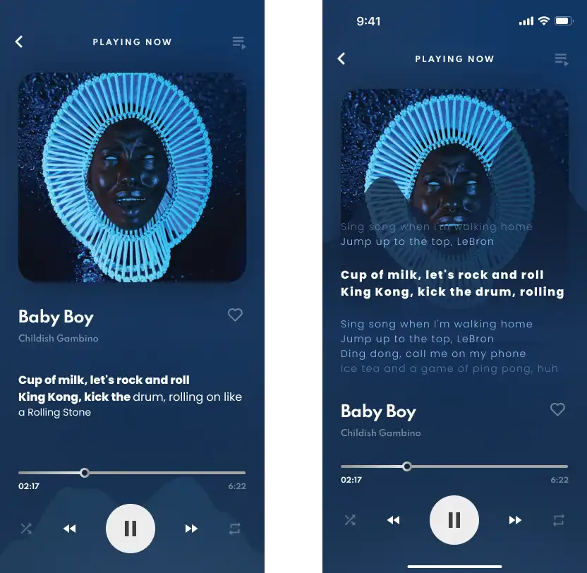
As the first design trail, I tried to display the lyrics which are always on and users do not need a separate interaction to view the lyrics. In the second variant, the moved the floating graph to the top and displayed more lyrics overlapping the song cover.
Even though this design seems visually appealing, not all users might not need or want to see the lyrics on their musicplayer screen and for the users who actually want to read the lyrics this will be a restricted view. Hence decided to explore other designs.
As the first design trail, I tried to display the lyrics which are always on and users do not need a separate interaction to view the lyrics. In the second variant, the moved the floating graph to the top and displayed more lyrics overlapping the song cover.
Even though this design seems visually appealing, not all users might not need or want to see the lyrics on their musicplayer screen and for the users who actually want to read the lyrics this will be a restricted view. Hence decided to explore other designs.
As the first design trail, I tried to display the lyrics which are always on and users do not need a separate interaction to view the lyrics. In the second variant, the moved the floating graph to the top and displayed more lyrics overlapping the song cover.
Even though this design seems visually appealing, not all users might not need or want to see the lyrics on their musicplayer screen and for the users who actually want to read the lyrics this will be a restricted view. Hence decided to explore other designs.
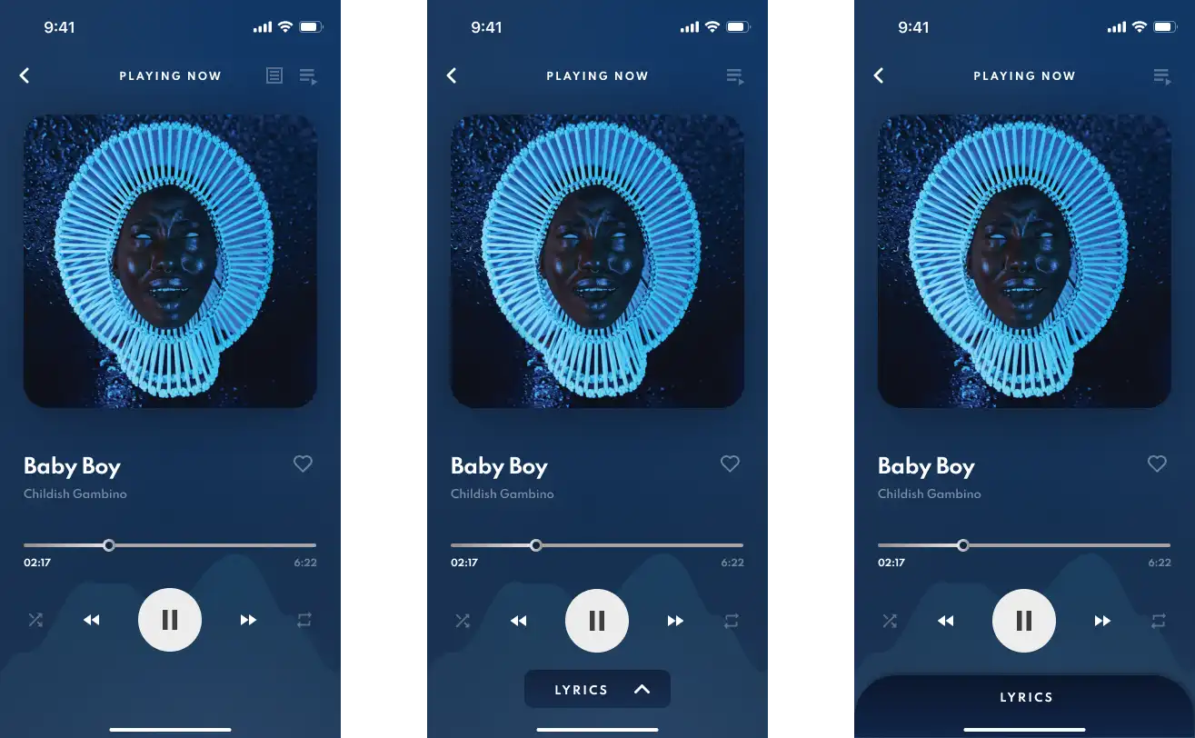
In order to display the lyrics on a separate screen, first I decided to design a button for users to interact with. One way I thought of was to include an icon on the top navigation bar to open the lyrics. However, I decided against it as the button did not seem discoverable and was a standout feature.
Hence, I decided to come up with a more prominent button and added a tap/swipable card button at the bottom for better visibility matching the original design.
In order to display the lyrics on a separate screen, first I decided to design a button for users to interact with. One way I thought of was to include an icon on the top navigation bar to open the lyrics. However, I decided against it as the button did not seem discoverable and was a standout feature.
Hence, I decided to come up with a more prominent button and added a tap/swipable card button at the bottom for better visibility matching the original design.
In order to display the lyrics on a separate screen, first I decided to design a button for users to interact with. One way I thought of was to include an icon on the top navigation bar to open the lyrics. However, I decided against it as the button did not seem discoverable and was a standout feature.
Hence, I decided to come up with a more prominent button and added a tap/swipable card button at the bottom for better visibility matching the original design.
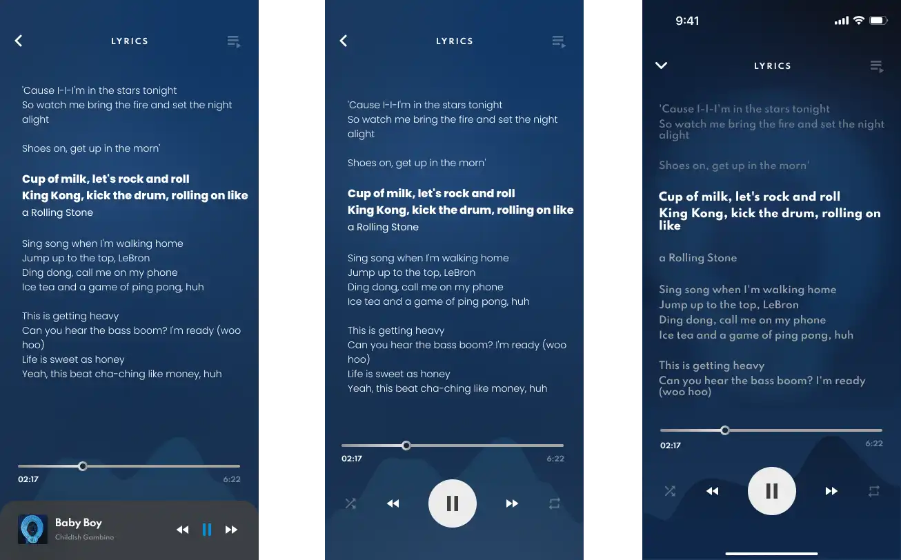
Iterated through the design to show full-length lyrics and came up with the design with a darker gradient based on the song cover colors and the blurred song cover itself as the background layer for the lyrics to appear on with standard music controls at the bottom.
Iterated through the design to show full-length lyrics and came up with the design with a darker gradient based on the song cover colors and the blurred song cover itself as the background layer for the lyrics to appear on with standard music controls at the bottom.
Iterated through the design to show full-length lyrics and came up with the design with a darker gradient based on the song cover colors and the blurred song cover itself as the background layer for the lyrics to appear on with standard music controls at the bottom.
Finalised Design
Finalised Design
Finalised Design
Takeaways and Further steps
Takeaways and Further steps
By completing this project I gained a deeper understanding of design systems, component systems, and variants as well as blending techniques such as gradients and blur effects on figma. Also learned a few soft skills such as communicating the design ideas and decisions, documenting the changes and designs, and coming up with the design rationale.
Further steps would be to conduct user research and test the current design to see how to design performs and make the changes necessary.
With the positive responses given by the users, as a designer, I understood how a small design change/ decision could create a lasting impact on the users and change the outlook of the entire product. I also learned the importance of research and finding the right themes/ drawing insights to solve a problem.
Moving forward, I'd conduct in-depth usability testing and see how users follow the set paths/user flows to each goal and modify the app accordingly for the best results.
Checkout more Projects
Checkout more Projects
Project Overview